|
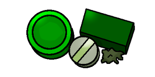
So Make School - a programming school based in California - is running a contest of sorts for people to create apps. I learned about it pretty late in the process and I'm still a beginner in all coding, I really doubt I will win anything, especially when there's people in their 20s submitting, but I still wanted to submit. After all, it's good experience, perhaps a few people will see my game after all, and there is a raffle prize so who knows? You're allowed to submit projects that you had started before the competition actually did, making me wish I had looked into app design earlier. The game I'm making is a simple app called Color Car. It's a simple scrolling avoid-the-objects game. "It's the future and self driving cars are about, but due to people being sucked into their virtual worlds, the roads are a mess! Lucky for you, the world is also digitized, and by changing the frequency of light (color) that your car is on, you can go straight through the obstacles!" I originally intended for it to be a simple web game due to the need to be able to press many different buttons, but as of now I've modified the controls to make it work on mobile by making the car self-driving, and you just change the colors to go through obstacles. I'm doing what I can from memory and referencing the tutorials I have already completed for the rest. The touchscreen controls are really throwing me off right now though, so I need to work on that. Otherwise it is coming along pretty smoothly so far, though I'd like to add much more than I'll probably have time for to fit in the deadline. There's not much else to say about it as of now, so here's some of the artwork so far. I've had some perspective issues with it so far, but since it's not a very realistic game, I think it's better in this case to have icons that are easy to understand instead of super realistic ones. However, I will keep it in mind as something I need to improve on: Car Sprites
I'll make another post later once I've made some more progress and hopefully I'll have the link to where you can upvote it and play it!
1 Comment
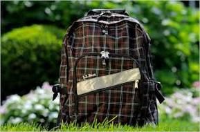
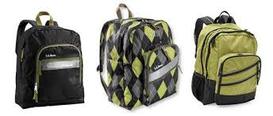
For this post, we had to choose a product we use, and examine how color is used in the ads for said product. I chose an L.L.Bean book bag. The three images below are all promotional images for the backpacks.
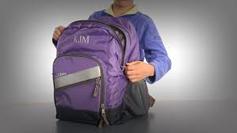
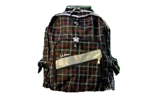
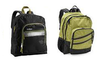
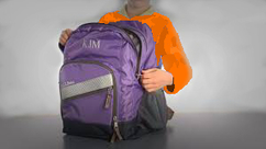
The image on the left primarily uses green, brown, and white. While in most other L.L.Bean pictures have a solid white background, this image uses trees and flowers as a background. This is probably due to the color of the backpack itself. Brown is typically thought of as dull and boring, and usually is seen as less fashionable than other dull colors like gray. Rather than just placing a brown book bag on a white background, they needed something else in the background to make it stand out. Brown is also associated with nature, and therefore is often paired with green. They made sure to keep any bare branches out of the shot, so that the only major brown area will be the book bag itself. The colors together make the brown more appealing, because they are naturalistic and the brown in nature isn't usually though of as ugly. The green and white of the landscape also emphasizes the green and white lines on the pattern of the book bag. Overall, it makes me feel happy, warm, and energized. The book bag seems outdoorsy, which makes me feel as if it could withstand a lot. It just makes me want to go on a hike. The top image on the right has a plain white background, but it uses the similar colors of the three book bags to create unity within the picture. Gray, green, white, and black are the only colors used in the image. The greens are very similar in shade, as are the other colors. The bag in the middle has a wider variety of colors than the other two, and brings the other two together. The plain background makes all of the bags really stand out, even when the major color is black. There's a certain sense of calmness and sophistication in the picture because of the colors as well because of the less vibrant hue of green and the color black. The last image uses a vignette effect with a white background, a violet book bag as the main focal point, and uses the person's indigo-purple shirt to compliment it. The white background stands out in the middle of the vignette. The nature of the vignette with the black fading as it gets closer to the middle also helps make a smooth transition to the center. Purple and indigo are analogous colors, so it makes sense that they would put them together. The image personally makes me feel calm and sort of sleepy.
Here I've (poorly) edited each of the images. For the image on the right I simply put the book bag against a white background. More of the reddish colors of the book bag stand out to me now, whereas before it had looked plain brown. There is a lot less emotion to the picture since now it is just one spot of dull muddy color in the middle of emptiness.
The second image has lost the middle backpack along with its cohesiveness. While the bags still have common colors (the black with greenish trim, the green with black trim) they don't have the same unity as before. It is much less interesting since it is just two solidly colored book bags without the nice transition/ blend that the bag in the middle had added. It's just some book bags now, with very little emotion at all. For the last image I changed the shirt color and attempted to nullify the vignette effect. Without the contrasting background, the focus still goes to the book bag, and almost more naturally. I think that the vignette effect was fairly unnecessary. Poor shading aside, the orange shirt adds contrast to the picture once more. While the colors aren't quite complimentary, the contrast still draws your attention. However, since the orange is so much brighter than any other color used, it draws attention away from the backpack. The one good thing about the vignette was the emotion it added. Without the contrasting values, there is much less of a dramatic feeling. The orange also makes this image feel more serious, almost as if some emergency is going on, probably because it is traffic cone orange. It's interesting to see how much changing the colors of an image can change the way that it is persevered, and the mood that it gives. |