|
We've been learning how to use the vector program Adobe Illustrator lately. Personally I really like it. My favorite thing has to be how smooth the lines look. It is very nice for line work, and that is how most people use it. The ease with which you can scale things is incredibly nice. I think that it's pretty easy to manipulate lines and shapes, though I still need more practice with the pen tool. I like all of the different features, particularly how easy it is to select one anchor point and move it so that you can have more specificity.
However, one problem that I have had is alignment. Without a classic eraser tool, it becomes difficult when the edge of a shape sticks out over another when they are supposed to line up. As I mentioned earlier, anchor points can be moved to try to remedy this, but often it isn't precise enough to be able to line them up. This may be because I had rotated the shapes in the instance where this was happening, but it was not very easy to fix. In the end, the eraser tool did work for me, but it was more difficult to use than I would have liked. I think that we will use this program for line work, and usually move to Adobe Photoshop for color, as I have heard people say that that is the most effective way to use to programs. This makes sense since Vector programs have such a limited color scheme. Illustrator will be useful for game making however if you need a logo or icon. For instance, in a card game you might want to have the game's logo on the back of each card, but also perhaps on the box. Though they might be different sizes, with a vector program, it wouldn't be a problem. Then, any art for a game that would need complex colors could be done in another program. Overall though, I think vector programs are pretty useful.
0 Comments
Just like last week's game night, I worked at the student-made games. Having played all of the games last week, I didn't try as many of them this time around. We still didn't have very many students come over, since the allure of console games like Smash was simply too much for most people to ever bother to check out PC games made by their peers. However, we did have a few students come over. Aside from turning on monitors and clarifying controls, the night was fairly uneventful. I wish that I would have known a bit more about how the games were made so that I could have talked to the students playing a bit more about the pathway. However, I didn't want to distract them from the game, so I don't know how much I would have talked to them even if I did have more useful information.
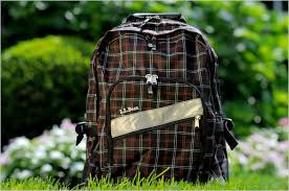
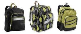
One thing I was surprised about with this game night was that as far as I know only one person attempted to complete the scavenger hunt that Mr. B set up for them to learn about the pathway. I doubt that anyone else had, because they would have had to get Serach or I to sign off for them playing a student-made game, and only one student asked. I understand that most people come to game night just to play, and aren't really thinking about their pathway (even though that is part of the purpose of game night) but the lack of participation was kind of sad. Students seemed to like the student-made games fairly well. Most people played Alice's Nightmare, but there were also big groups of people playing Nebula 5, as well as Bomb Defuser. This time around, I did play the one game that I hadn't tried before, Push on Your Eyes. While I didn't play it for too long due to difficulty and feeling obligated to not stay on the computer forever, I really liked the general concept of the game. While the graphics were simple, the game play was unique and complex. It's the kind of game I would probably be interested in making: One where you have to pay attention to the little details and search for clues. However, I also liked Alice's Nightmare because of how much of a storyline it had. It might have been because I already knew the basics of the world of Alice in Wonderland, but it felt much more planned out, and wasn't just do something for no reason. This also was because any objective in the game past just getting down the first rabbit-hole was prompted by a character making a request. All of the games were very impressive though, and harder to make than they look. I part of the reason that they are under-appreciated by students is because they have- for the most part- never attempted to make a complete game. Next year, I think finding another way to get students more involved in actually asking about the pathway would be good. Whether this is game design students actively walking up to students and striking up a conversation, or some other incentive to not just sit at Smash the whole time, it would be beneficial for anyone who is interested in the pathway to learn about it. It seemed like security was better for the second game night, so a similar system next year would be good as well. Overall, I think most people had a lot of fun. For this post, we had to choose a product we use, and examine how color is used in the ads for said product. I chose an L.L.Bean book bag. The three images below are all promotional images for the backpacks.
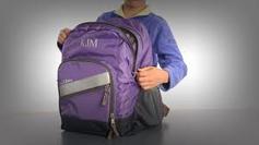
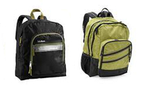
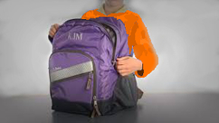
The image on the left primarily uses green, brown, and white. While in most other L.L.Bean pictures have a solid white background, this image uses trees and flowers as a background. This is probably due to the color of the backpack itself. Brown is typically thought of as dull and boring, and usually is seen as less fashionable than other dull colors like gray. Rather than just placing a brown book bag on a white background, they needed something else in the background to make it stand out. Brown is also associated with nature, and therefore is often paired with green. They made sure to keep any bare branches out of the shot, so that the only major brown area will be the book bag itself. The colors together make the brown more appealing, because they are naturalistic and the brown in nature isn't usually though of as ugly. The green and white of the landscape also emphasizes the green and white lines on the pattern of the book bag. Overall, it makes me feel happy, warm, and energized. The book bag seems outdoorsy, which makes me feel as if it could withstand a lot. It just makes me want to go on a hike. The top image on the right has a plain white background, but it uses the similar colors of the three book bags to create unity within the picture. Gray, green, white, and black are the only colors used in the image. The greens are very similar in shade, as are the other colors. The bag in the middle has a wider variety of colors than the other two, and brings the other two together. The plain background makes all of the bags really stand out, even when the major color is black. There's a certain sense of calmness and sophistication in the picture because of the colors as well because of the less vibrant hue of green and the color black. The last image uses a vignette effect with a white background, a violet book bag as the main focal point, and uses the person's indigo-purple shirt to compliment it. The white background stands out in the middle of the vignette. The nature of the vignette with the black fading as it gets closer to the middle also helps make a smooth transition to the center. Purple and indigo are analogous colors, so it makes sense that they would put them together. The image personally makes me feel calm and sort of sleepy.
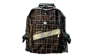
Here I've (poorly) edited each of the images. For the image on the right I simply put the book bag against a white background. More of the reddish colors of the book bag stand out to me now, whereas before it had looked plain brown. There is a lot less emotion to the picture since now it is just one spot of dull muddy color in the middle of emptiness.
The second image has lost the middle backpack along with its cohesiveness. While the bags still have common colors (the black with greenish trim, the green with black trim) they don't have the same unity as before. It is much less interesting since it is just two solidly colored book bags without the nice transition/ blend that the bag in the middle had added. It's just some book bags now, with very little emotion at all. For the last image I changed the shirt color and attempted to nullify the vignette effect. Without the contrasting background, the focus still goes to the book bag, and almost more naturally. I think that the vignette effect was fairly unnecessary. Poor shading aside, the orange shirt adds contrast to the picture once more. While the colors aren't quite complimentary, the contrast still draws your attention. However, since the orange is so much brighter than any other color used, it draws attention away from the backpack. The one good thing about the vignette was the emotion it added. Without the contrasting values, there is much less of a dramatic feeling. The orange also makes this image feel more serious, almost as if some emergency is going on, probably because it is traffic cone orange. It's interesting to see how much changing the colors of an image can change the way that it is persevered, and the mood that it gives. |